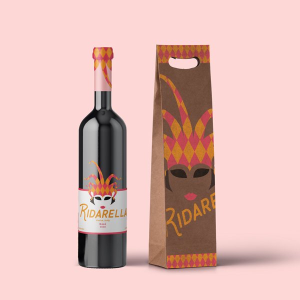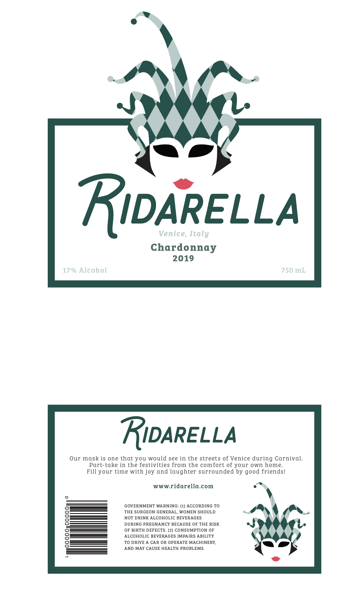

According to research, “ridarella” is an italian word that means laughter. Therefore, the name of this wine has been named after that. The entire concept of the brand is inspired by the Venice Carnival that occurs every year. During this Carnival, people dress up, wear masks and parade around. People attend big masquerade parties and have a good time in the city of Venice.
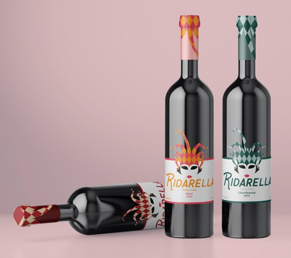
Since the brand is inspired by this event, it is targeted towards a femenine inclined society that enjoy some wine while surrounded with friends and having fun. Whether it’s a party or a small girls night out. This wine brand is versatile and offers three main flavours between others.
The colour palette has been carefully chosen to represent each of the wine colours (red, white and rose), while portraying playfulness and fun.
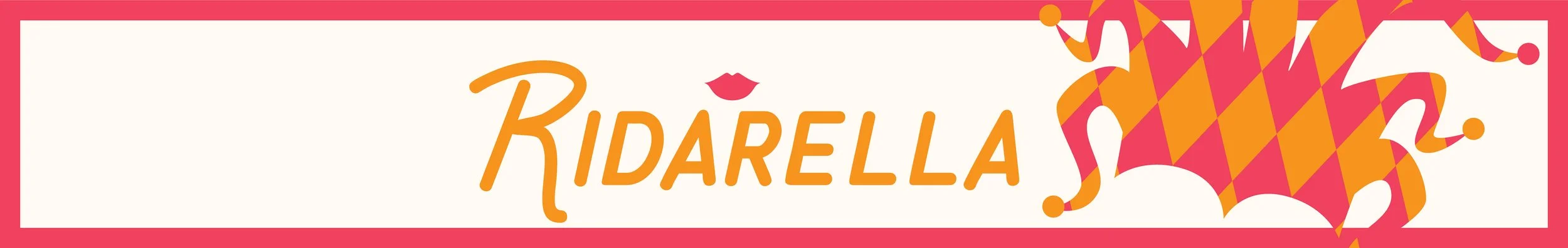
The typefaces chosen play well with the playfulness and fun side of the brand. The typeface chosen for the logo is a typeface that uses all capital letters while keeping the first letter with a larger height. This typeface compliments the mask/jester logo by giving it a circus and clown sensation. Both of which are meant to make people have fun and laugh.
“Ridarella” is a brand of wine that is meant to cheer you up, help you let loose and have fun.